


Verticons Icon Pack
4.8307.00 Reviews
App Specs
- Version
- 2.5.9
- Updated On
- License
- $0.90
- Downloads
- 100,000+
- Developer
- SpaceMan
- Categories
- Personalization
- Platform
- Android
Screenshots
 Analysis by AppCompare
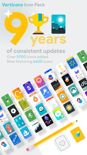
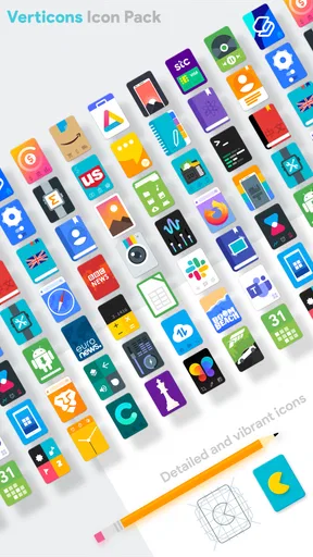
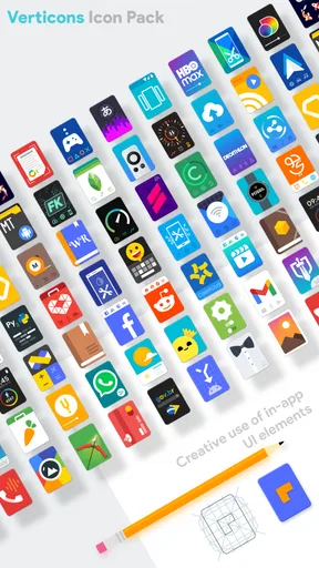
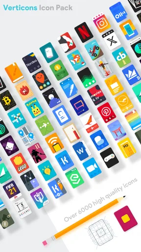
When several people use the same Android tablet or phone, small visual choices can make a surprising difference. I found Verticons Icon Pack especially interesting in that setting because it changes the home screen without changing how the device works. Its focus is simple: app icons become vertically oriented rectangles, giving the launcher a more orderly, almost dashboard-like appearance.
I reviewed it as a personalization app from SpaceMan, and my first impression was that it is aimed at people who care about consistency rather than dramatic decoration. The pack does not try to turn the whole device into a themed world. Instead, it gives the icons a shared shape and lets the wallpaper, widgets, and launcher layout remain part of the design. That makes it easier to use on a personal phone, but also practical on a household device where different people may prefer different apps.
How Verticons works on a shared household device
A shared tablet often becomes visually messy over time. One person adds school tools, another keeps streaming apps nearby, and somebody else installs games or shopping utilities. Even when the launcher places everything in sensible positions, a mixture of circular, square, and oddly shaped icons can make the screen feel disorganized. The rectangular treatment here gives those unrelated apps a common visual frame.
In my experience, that matters most when the device is passed around rather than owned by one person. A child looking for a learning app, a parent opening a calendar, or a guest trying to find a video service can scan the screen more comfortably when the icons have a consistent silhouette. The pack does not decide where apps belong, but it makes the arrangement easier to read once the household has agreed on a layout.
One useful approach is to keep the first home-screen page deliberately neutral. I would place the apps used by everyone there, then move personal or occasional apps to later pages or folders. Verticons helps this plan because the uniform rectangles make a folder-heavy layout look less visually uneven. The result is not a family-management system; it is simply a cleaner visual language for a device that several people touch.
That distinction is important. The icon pack cannot separate accounts, hide private content, limit access, or coordinate schedules. If the device needs those protections, the launcher and operating system settings remain responsible. I would treat this app as the finishing layer after those practical boundaries are already in place, not as a replacement for them.
What the first setup feels like
Before installing any icon pack, I recommend checking whether the launcher supports custom icon packs. This is the first real boundary of the experience. Verticons is designed to work through a compatible launcher, so the quality of the result depends partly on the launcher’s own theme controls. On a supported setup, applying the pack is straightforward; on an incompatible one, the purchase will not magically change the icons.
Worth Reading Before You Choose

EA SPORTS FC Mobile 26 Is a Bigger Football Game, but It Takes Time

Flipboard Shows What News Apps Must Do Beyond the Feed

Switching to Android Auto Means Rethinking Your Driving Routine

Google Calendar Makes a Crowded Week Easier to Manage

Ludo King Makes the Most of the Minutes Between Plans

Baby Panda World Brings Quick Play to Modern Phones, but Its Game Library Feels Busy
After applying it, I would spend a few minutes checking the home screen page by page. A family device tends to collect apps from different sources, and an icon pack may not visually replace every single app. When an icon remains in its original style, the contrast can be noticeable beside the new rectangular icons. I found that grouping less-used apps into folders is a practical way to reduce that unevenness.
There is also a useful trade-off between a completely themed screen and a partly themed one. A fully consistent screen looks more polished, but it may require reorganizing folders and removing duplicate shortcuts. A mixed screen takes less time and may be better for a shared device where people already know the location of their favorite apps. I would not reorganize everything just for appearance unless the household is already frustrated by the current layout.
The pack is available for Android devices running at least Android 5.0, which covers a broad range of older and newer hardware. That does not guarantee identical results on every phone or tablet, because launcher support and icon masking can differ. Still, the relatively broad system compatibility makes it more approachable for households that keep an older tablet in circulation instead of replacing it frequently.
Setting boundaries without making the screen confusing
For a shared device, visual clarity is most helpful when it follows a simple rule. I prefer one page for common tools, one page for entertainment, and folders for apps that only one person uses. The vertical shape of the icons makes these sections feel related, but it does not force a particular arrangement, so each household can adapt the layout to its routine.
A practical tip is to use the icon pack after deciding which shortcuts should remain visible. If every installed app is placed directly on the home screen, the new style cannot solve the underlying clutter. Removing duplicate shortcuts first makes the rectangular design more effective. I also found that keeping one or two important apps in the dock helps people locate them quickly, especially when the device is used by someone who did not arrange the screen.
Another small but useful workflow is to take a screenshot of the agreed layout before changing it. On a shared phone or tablet, someone may move icons while trying to personalize the screen. Having a reference makes it easier to restore the common arrangement without an argument about where everything belongs. This is not a feature of Verticons, but it is the kind of habit that lets the pack deliver more value in a household context.
The visual style can also influence how quickly people recognize apps. Rectangular icons may look more uniform, but they can reduce some of the distinctive outlines people use as memory cues. If a family member identifies an app mainly by its familiar circular logo, the new appearance may take a little adjustment. I would introduce the pack gradually on a device used by young children or older relatives, rather than changing every shortcut immediately.
Coordinating different users on one home screen
Coordination works best when the home screen communicates shared priorities. For example, a household might keep the browser, camera, messages, calendar, and a video app in common view, while placing work or school tools in clearly named folders. Verticons gives those areas a consistent appearance, so the screen feels intentional even when the apps serve very different purposes.
I would avoid using color alone to identify ownership, since the pack’s main strength is its shared shape rather than a complicated color-coding system. Instead, folder names and position do the organizational work. A folder for school, another for work, and another for travel is easier to explain than expecting everyone to remember a decorative theme. The icons then support the structure instead of becoming the structure.
There is a particularly useful benefit for guests. When somebody borrows the device briefly, a regular grid of similarly shaped icons is easier to scan than a screen filled with inconsistent artwork. The guest still needs to know which app they want, but the interface feels less visually noisy. I noticed that this is more valuable on tablets, where a large screen can otherwise make scattered shortcuts look disconnected.
At the same time, I would not recommend the pack if the household depends on every person having a radically different visual environment. A single icon theme cannot satisfy someone who wants a minimalist monochrome setup and someone else who prefers bright, highly distinctive icons. In that case, separate user profiles or separate devices are a better answer. Verticons is strongest when the household wants one calm, shared appearance.
Age, trust, and the limits of personalization
The content rating is Everyone, so the app itself is suitable for a broad audience. That describes the nature of the icon pack, not the apps displayed on the home screen. A household can use the theme on a child’s tablet, but the pack does not assess the age suitability of other installed apps or create restrictions around them.
This is where I think clear expectations matter. A parent may choose Verticons because it makes a child’s device look tidy, but visual order should not be mistaken for supervision. Account boundaries, screen-time decisions, purchases, and access to personal information still need to be handled through the device and the individual apps. The icon pack changes presentation only.
For older family members, the decision is more personal. Some people appreciate the consistent shapes because the screen looks less cluttered. Others rely on the original branding of an app and may find a themed icon less immediately recognizable. I would apply it first to a secondary device or ask the regular user to try it for a day. If recognition becomes slower, returning to the launcher’s default icons may be the kinder choice.
Trust also affects how much customization is appropriate. On a personal phone, I can rearrange everything to suit my habits. On a shared phone, changing icon positions or removing a familiar shortcut can create unnecessary friction. I found that the best household result comes from agreeing on the basic layout before applying the theme, then treating the pack as a shared visual decision rather than one person’s private makeover.
Visual details that matter more than expected
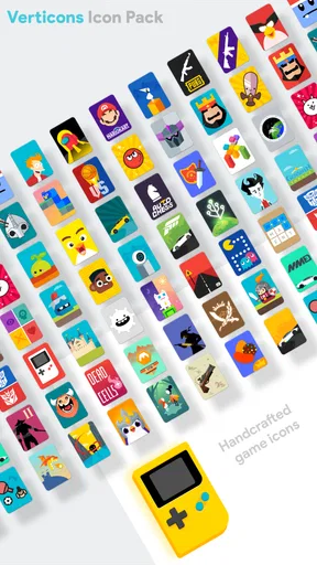
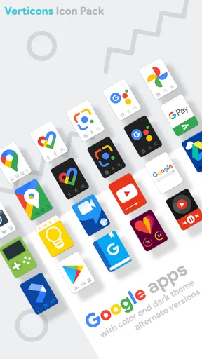
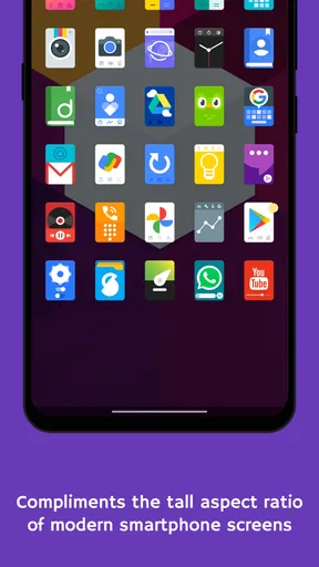
The defining feature is the tall rectangular proportion. It gives the home screen a more vertical rhythm than circular icon packs, particularly when the launcher uses a regular grid. This can make rows feel more aligned, although the final impression depends on icon size, spacing, wallpaper, and the launcher’s grid settings.
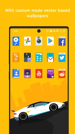
I recommend pairing the pack with a simple wallpaper rather than a highly detailed image. Busy backgrounds compete with the rectangular outlines and make the screen harder to scan. A restrained background lets the icon shapes do their job. Conversely, if someone in the household loves expressive wallpapers, the pack can provide enough structure to keep the result from becoming completely chaotic.
Widgets deserve attention too. A large widget beside compact rectangular icons can dominate the page and make the theme feel unbalanced. I prefer placing a useful widget on its own page or using a smaller one above the most frequently used apps. This is a subtle adjustment, but it helps the icon style remain visible instead of being lost among oversized panels.
One non-obvious advantage is that the theme can make inconsistent app branding less distracting. Many apps use different logo shapes and visual weights, so a standard icon treatment can make the launcher feel more deliberate. The trade-off is that some app logos lose their original personality. If the household uses a small number of apps repeatedly, recognizable default branding may still be more efficient than visual consistency.
Performance, cost, and long-term practicality
Verticons costs $0.90, with optional in-app purchases ranging from $0.99 to $9.99 per item. For a household, that makes it important to understand what is being paid for before treating it as a shared-device improvement. I see the base price as modest for a cosmetic change, but the value depends entirely on whether the rectangular style suits the launcher and the people using it.
The app has an average rating of 4.8 from around 2.4 thousand ratings, and it has passed 100 thousand installs. Those figures suggest that the visual concept has found a receptive audience, but they should not replace a personal compatibility check. Icon packs are unusually subjective: a design that feels clean to me may feel unfamiliar or too uniform to someone else in the household.
SpaceMan released the app on October 1, 2017, and the current version is 2.5.9. I mention that because long-running personalization apps can be attractive for older devices, but they also make launcher compatibility worth checking before purchase. I would look at the launcher currently installed, confirm that it accepts icon packs, and only then decide whether the style is worth adopting across a shared device.
In everyday use, an icon pack should not add a new routine. Once applied, it is mostly passive. The maintenance comes from newly installed apps, changed shortcuts, and family members moving icons around. If the household installs apps frequently, occasional cleanup will still be necessary. Verticons can make that cleanup look better, but it cannot automate the organizational work.
How it compares with default icons and other themes
The default launcher is the simplest alternative. It usually offers the clearest connection to each app’s original branding and requires no extra setup. If everyone already finds the home screen easy to navigate, staying with the defaults is sensible. Verticons becomes worthwhile when the mixed shapes bother you or when a shared device needs a more coherent appearance.
Compared with circular icon packs, this design feels less playful and more structured. Circular themes often blend smoothly with modern launchers and can look familiar because many default icons already lean that way. The vertical rectangles create a stronger identity, which is a benefit if you want the home screen to look distinct, but a drawback if you prefer icons that disappear into the wallpaper.
Compared with a full launcher replacement, Verticons is much less disruptive. It does not require learning a new navigation system or changing every gesture and page behavior. That makes it a good choice for a family that wants a visible improvement without retraining everyone. A full launcher is better when the real problem is app organization, user profiles, gestures, or automation rather than icon appearance.
Compared with manually replacing icons one at a time, a pack is more consistent and less tedious. Manual customization can produce a very personal result, but it takes patience and tends to become uneven when new apps are added. Verticons offers a ready-made visual direction, while still leaving the household free to decide which shortcuts belong on each page.
Who should use it, and who should skip it
I would recommend Verticons to someone who wants a distinctive Android home screen, prefers orderly grids, and is comfortable checking launcher compatibility. It is particularly appealing for a shared tablet where several people need to recognize common apps without the screen looking like a random collection of logos.
It also suits users who want personalization without replacing the launcher. The change is noticeable, but it does not demand a complete redesign. For an older Android device that still works well, the pack can provide a fresh appearance without requiring new hardware.
I would skip it if the device uses an unsupported launcher, if every family member depends heavily on the original app logos, or if the main issue is access control rather than visual clutter. I would also avoid imposing it on a child or older relative who finds changed icons confusing. In those cases, familiar defaults are more useful than a coordinated theme.
Before paying, I would make three checks: confirm launcher support, decide whether the regular users like tall rectangular icons, and identify which apps must remain instantly recognizable. Those checks take little time and prevent the most common disappointment. The purchase is not a solution for a badly organized home screen, but it can make a good layout feel much more finished.
My household verdict
After using it as a personalization layer, I see Verticons as a focused and attractive choice rather than an all-purpose customization tool. The vertical rectangles give a shared device a calmer visual identity, and they work especially well when the household has already agreed on pages, folders, and common shortcuts.
Its limitations are equally clear. It does not manage accounts, protect private information, control age access, or keep family members from changing the layout. It also depends on launcher support and may make some familiar app logos less recognizable. Those are not minor details when several people rely on one device.
Still, if your goal is simply to replace a mismatched collection of icons with something more deliberate, I think SpaceMan has made a convincing option. The price is low, the age rating is broad, and the design is distinctive without overwhelming the rest of the interface. My recommendation is to use it as the final visual layer after household organization is settled, not as a substitute for that organization.
For my own shared-device setup, I would install it when everyone agrees that consistency matters more than preserving every original logo. If that sounds like your household, Verticons Icon Pack is an easy way to make the home screen feel coordinated while leaving the underlying Android experience familiar.
Pros
- Distinctive vertical icon design gives home screens a fresh
- modern look.
- Includes a large collection of hand-crafted icons for popular apps.
- Supports many Android launchers
- making setup quick and flexible.
- Regular updates can add icons for newer apps and user requests.
- Matching wallpapers help create a more cohesive home-screen theme.
Cons
- Some less common apps may remain without a custom icon.
- Requires a compatible third-party launcher to apply the icon pack.
- The vertical style may not suit users who prefer traditional square icons.
- Icon masking for unsupported apps can look less polished than themed icons.
- Certain advanced features may depend on the launcher being used.
FAQs for Verticons Icon Pack
What is Verticons Icon Pack, and what does it change on my device?
Verticons Icon Pack is a custom icon collection designed to give Android home screens a distinctive vertical, rounded-rectangle appearance. After installation, it can replace compatible app icons with a consistent visual style, helping your launcher look more organized and polished. It does not replace the entire operating system or redesign every screen, since its effect mainly depends on launcher support and the number of included icons.
Which launchers are compatible with Verticons Icon Pack?
Verticons is intended for Android launchers that support third-party icon packs. Popular compatible options may include launchers such as Nova Launcher, Lawnchair, Microsoft Launcher, Smart Launcher, and other customization-focused alternatives, although compatibility can vary by version and device. Before downloading, check your launcher’s icon settings. Some manufacturer launchers may offer limited support or require manual application through their customization menu.
Will Verticons change every app icon automatically?
Not necessarily. The pack includes a large selection of themed icons, but no icon pack can usually cover every application available on the Play Store. Supported apps should receive the designed Verticons artwork, while unsupported apps may keep their original icons or use an icon request and masking option, depending on your launcher. You may also need to apply missing icons manually for the most consistent result.
Does Verticons Icon Pack include wallpapers, widgets, or custom icons?
Verticons primarily focuses on app icons, but the overall experience may also include complementary wallpapers or tools for browsing and applying the collection, depending on the version available on your device. It is not a full widget platform or complete home-screen replacement. To create a cohesive setup, you can combine the icons with a matching wallpaper, compatible widgets, and a launcher that allows detailed grid and layout customization.
Is Verticons Icon Pack free to use, and are there any limitations?
Availability and pricing can vary, so you should review the current store listing before installing. If the version is paid or includes optional purchases, those details should be visible on the download page. The main limitations are usually related to launcher compatibility, incomplete coverage for newer or less popular apps, and the need to configure the pack manually. Android customization features may also differ between manufacturers and operating-system versions.


